Design
Everything about how your page looks lives in one panel. Open My Page and press Design beside the Profile caption, or click anywhere off a block, and the right-hand column becomes the design controls for the whole page.
Six sections, in this order: Style, Color, Type, Header, Buttons, Motion. Nothing folds, and every section header carries its own current value on the right, so the panel can be read from the headers alone. Every control changes the page in the middle of the screen as you touch it.
Style
Six presets, each a complete look rather than a colour swap.
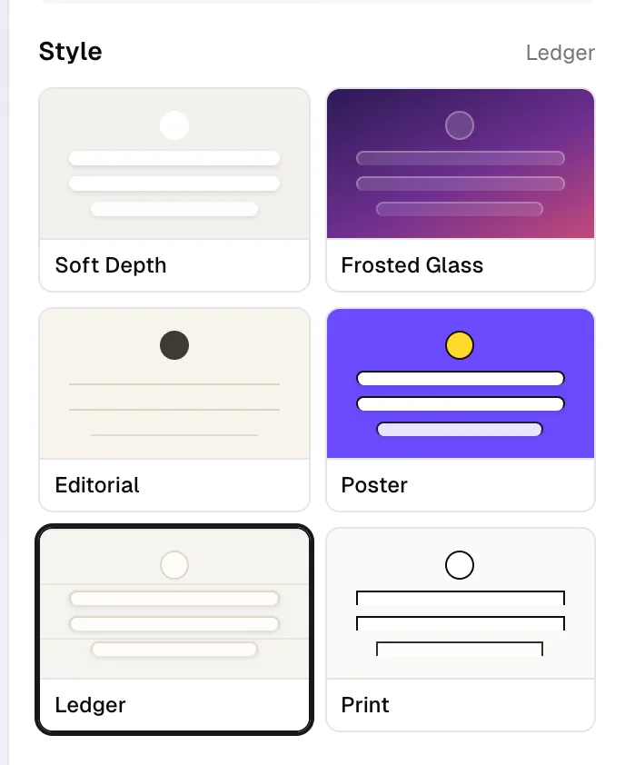
- Soft Depth. Warm ground, floating cards, gentle shadows. This is the default.
- Frosted Glass. A rich backdrop with translucent blurred blocks over it. Its own look is a purple gradient; pick a scheme or your own colors and the backdrop takes them, with the blocks still frosted.
- Editorial. Typographic and left aligned, with hairline rules instead of cards.
- Poster. Loud colour, thick borders, hard shadows, uppercase titles.
- Ledger. Warm paper ruled with a faint hairline, blocks as flat panels with a thin outline and a small offset shadow.
- Print. Near white, black rules, outlined boxes with square corners, and a block that inverts under the pointer.
Ledger and Print are both light pages by design. They stay light whether your visitor's phone is set to light or dark mode. They are also the two presets that hold their own corner: pick Pill and they square it off to the radius the preset is built on, because a rounded outline box is not what either of them is.
A preset decides the shape of your blocks, their alignment, their corner radius, and their shadow. Colours, fonts, buttons, and avatar shape sit on top of it and stay yours when you switch, so you can try all six in a row without losing your palette.
Color
Scheme is twelve ready-made pairs: Default, Dark, Sage, Purple, Coral, Sky, Royal, Rose, Slate, Mint, Sand, and Neon. Each sets a background and a text colour together, in one click, and its swatch is drawn the way the page will wear it: the background as the ground, the text colour as the avatar and buttons on top.
Background is a switcher with four kinds:
- Solid. The background colour below.
- Gradient. Pick a From colour and a To colour. Switching to Gradient seeds both from what you already had, so the change is visible immediately rather than after your first pick.
- Pattern. A texture drawn behind your page in your own two colours.
- Image. Your own picture behind the page. This one is Pro; on Free it carries a lock.
Under them are the colour wells: Background, shown when the background is solid, and Text & buttons. Each is a swatch and a hex field you can type into, so a brand colour can be pasted in rather than hunted for inside your operating system's colour picker. Buttons take their colour from the text colour, so there is one control rather than two.
Touch either well and the section header switches to Custom, and a Reset to scheme link appears. Picking a ready-made scheme writes both colours, so a scheme click after your own picking replaces what you chose. Do the scheme first, then the fine tuning.
If your background and text end up too close together to read, urls.bio steps in: when the contrast falls below 3:1 it forces the text to black or white so the page stays legible. That override is applied at render, so the picker still shows the colour you chose.
Patterns
Choosing Pattern reveals a strip of seven, each drawn as you see it rather than approximated.
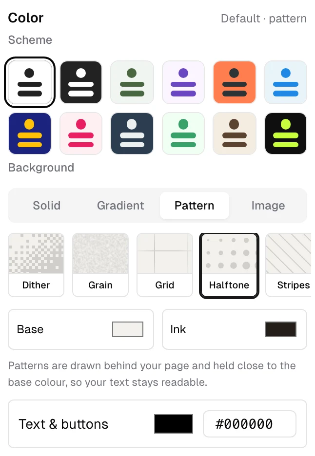
- Dither. A soft diagonal fade, quantised into pixels.
- Grain. Fine film noise over a flat colour.
- Grid. Thin ruled lines, faded towards the edges.
- Halftone. Printed dots growing along a diagonal.
- Stripes. Thin diagonal hairlines.
- Topo. Contour lines from layered waves.
- Mesh. Two very soft blooms of colour.
Under the strip are two wells, Base and Ink. Base is the ground the page sits on, and the colour your browser paints behind the page, so pulling down at the top or bottom shows it rather than a white edge. Ink is what the pattern is drawn in. Both are seeded from the theme you are already wearing, so the first pattern you tap already belongs to your palette.
Whatever you choose for Ink is held close to Base before anything is drawn, and the panel says so: "Patterns are drawn behind your page and held close to the base colour, so your text stays readable." A pattern is texture behind your words, not a second layer of content.
The pattern is drawn once, on a canvas behind the page. Nothing about it moves, at any setting.
Type
Fourteen fonts, each shown as a row set in its own face with the sample "Aa Bb 123", so you pick by looking rather than by name:
Default (the site font), Inter, Poppins, Space Grotesk, DM Serif Display, Playfair Display, Lora, JetBrains Mono, Archivo, Manrope, Bricolage Grotesque, Fraunces, Instrument Serif, and Space Mono.
Only the font you pick is loaded, so choosing one does not cost your visitors thirteen others. Your choice covers the whole page: your name, your headings, your block titles, and the text on your buttons.
Header
Three layouts for the top of the page, drawn rather than named.
- Classic. Avatar, name, bio, and social icons stacked at the top. No cover image.
- Cover. A cover band across the top with your avatar overlapping its bottom edge, then name, bio, and socials underneath.
- Hero. A taller cover image with your name set over the bottom of it, darkened towards the base so the name stays readable. Bio and socials sit below it, and the avatar is not shown.
Picking Cover or Hero reveals an upload control for the cover image right underneath. Until you upload one, both fall back to the Classic header, so nothing breaks while you are mid-change.
Avatar shape is Circle, Square, or Squircle. Once you have uploaded an avatar a fourth option, Cover, appears alongside them. With no avatar uploaded, your page shows your initials in the shape you picked.
Buttons
Shape is Square, Rounded, or Pill: no corner at all, a soft corner, or fully round. Fill is Solid or Outline. Six combinations, and the page shows each one as you click it.
If your page was made before there were three shapes, or came across from an import, it keeps exactly the corner it was saved with and the picker shows whichever of the three it is closest to. Nothing changes under you until you pick a shape yourself.
The tab strip follows the same two choices, so a pill page gets a pill strip. See tabs.
Block details
One switch, Block details, at the bottom of the Buttons section. On, which is the default, link, file, embed, tickets, discount code, and chat blocks show the small i that opens their details sheet on the public page. Off hides the mark on every block and disables the sheet; any notes and previews you have written stay saved for when you turn it back on. See block details.
Motion
One control, setting what every block on your page does as a visitor scrolls to it. It is off until you turn it on. See motion.
Saving
Two speeds, both automatic.
- Colours, fonts, and backgrounds save half a second after you stop moving, so dragging a colour picker writes once rather than fifty times.
- Style, layout, button, and avatar changes write the moment you click.
The page updates instantly either way, so what you see is always ahead of the save, never behind it. If a write fails the control snaps back to its last saved value and a message tells you which one did not stick, for example "Could not save the theme." The pill in the dashboard header is the general answer to "is my work saved?".
Design changes join the same undo history as your blocks, so Cmd+Z walks back a colour as readily as a title.
Common questions
Is any of this behind Pro? Only one thing: an image background. Every preset, scheme, font, pattern, layout, and button combination is on the free plan.
Does this affect what people see when they share my link? Yes. The link preview card is drawn in your own theme, with your background, avatar, and name. See sharing.
Can I use my own CSS or a custom font file? No. The fourteen fonts and the colour controls above are the whole surface.
Where is the cover image control? It appears under Header once you pick Cover or Hero. It is not shown for Classic, because Classic has nowhere to put it.
Something looks wrong on a phone but fine on the desktop view. The page in the middle renders at real widths. Use the Phone width and Desktop width toggles above it, and open the live page from the button at the top right to check the real thing.