The Studio
The Studio is the My Page tab: your blocks on the left, your live page in the middle, and whatever you have selected on the right. Nothing here is a mockup. The page in the middle is the page a visitor gets, rendered at the same width, with the same theme, from the same data.
Three columns
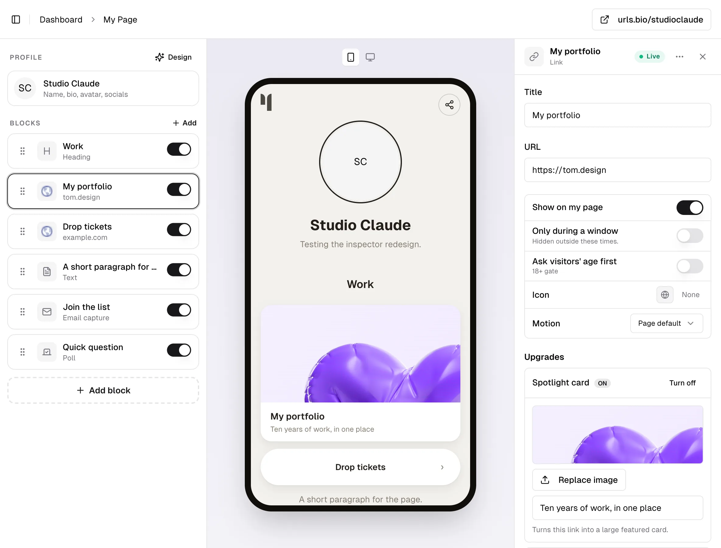
The block list runs down the left. Your profile sits above it under the caption Profile, holding your name, bio, avatar, and social icons; it cannot be deleted or reordered. Everything else sits under Blocks, in the order visitors see it. Each row shows the block's name, its type, and a switch for whether it is on your page.
If your page has tabs, a strip of them sits above the rows, with + Tab at its end. Selecting a tab filters the list and the page in the middle together, so what you drag is what that tab shows.
The stage sits in the middle. Two toggles above it, Phone width and Desktop width, switch how it is drawn, and the desktop view puts a browser bar with your address in it. Click any block on the stage to select it.
The inspector sits on the right. Select a block and it fills with that block's settings. Select nothing, or press the Design button beside the Profile caption, and it becomes the Design panel for the whole page. See design.
At the top right of the dashboard, the button with your handle on it opens your live page in a new tab. Beside it, a small pill reads Saving, then Saved, and tells you "Not saved" if a write fails. It appears on your first change of the session and not before.
Details and Design
There are no tabs. What you tapped is what opens: the profile card at the top of the list opens Details, for your name, bio, avatar and socials, and the Design button opens Design, for the whole page. Both are the profile panel wearing a different hat, and either one closes with Done.
Select an ordinary block and there are no tabs at all. The panel is that block, top to bottom.
Setting rows
Under a block's own fields is a list of one-line rows. The label sits on the left, its current value on the right, so the panel can be read without opening anything.
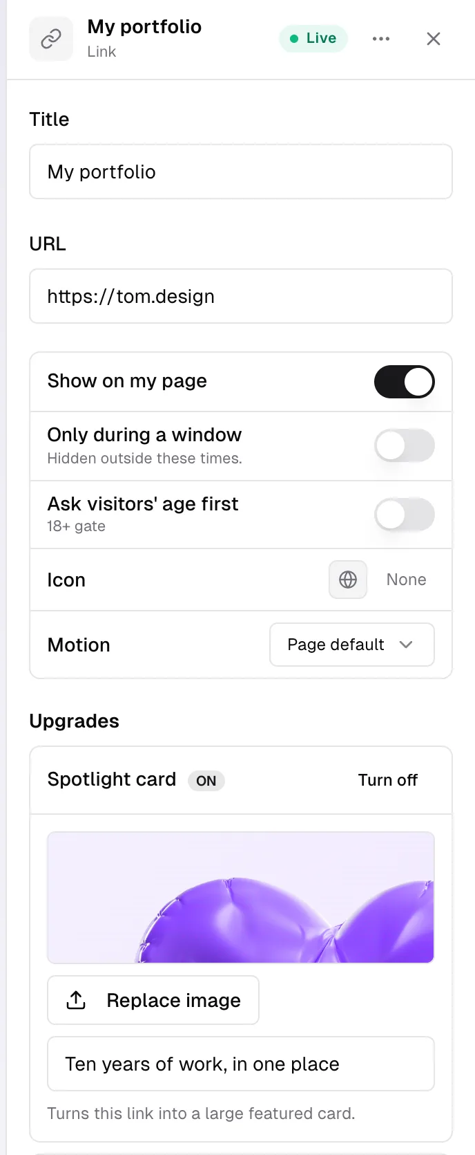
A link, for example, gets Show on my page, Only during a window, Ask visitors' age first, Look, then Icon or Cover depending on which Look it is on, Motion, and Tab once the page has tabs. Turning on a switch that needs more from you reveals its fields directly under the row, indented on a tinted strip, rather than opening a panel somewhere else. Nothing folds and nothing is hidden that the row does not already tell you.
The one exception is the Upgrades section on a link block, which does fold, because each of its two upgrades is a small screen of its own. See blocks and links.
The bar pinned above the settings carries the block's name, its type, and a chip saying where it stands: Live, Hidden, Scheduled, or Needs followed by the thing it is still missing.
The block menu
Right-click a block on a desktop, or press and hold it on a phone, and a menu opens on the spot:
- Edit selects it and puts the cursor in the inspector.
- Pin to top, or Unpin on a block that is already pinned, the same thing a swipe right does.
- Add above and Add below open the same picker the Add block button uses, and drop the new block next to this one instead of at the end.
- Duplicate makes a copy directly underneath. A draft cannot be duplicated, and the row says "Publish it first".
- Hide takes the block off your page and leaves it in your list. It reads Show when the block is already hidden.
- Delete removes it, with an Undo button in the message that follows.
The three dots in the inspector's title bar carry a shorter version of the same menu, plus Move to group and Change block type.
Adding a block, and saving it
Picking a block from the list does not put it on your page, and picking the wrong one costs you nothing.
A block that needs something typed into it opens its panel without joining your list at all. Put nothing in and close the panel, and there is nothing to tidy up: no row, no draft, your page exactly as it was. Type anything into it and it joins the list, marked Draft, not published, where only you can see it.
Fill it in and press Save block at the bottom of the panel. Until the block has what it needs, that button says what is missing instead, such as "Needs a valid URL". Once it is saved the chip at the top turns to Live and the block is on your page.
A draft you close is kept, with the Save button waiting when you open it again. To get rid of one, delete it like any other block.
Blocks with nothing to fill in skip all of this. A Divider, a Section, an Email capture and a Contact form are complete the moment they exist, so they are added straight away and there is no Save button on them. Adding one stays a single tap.
Changing what a block is
While a block is still a draft, its type is a button. Open it and look under its name in the title bar: tap the grey word there, or choose Change block type from the three-dot menu, and the block list opens. Whatever you pick, the block becomes, so grabbing the wrong one costs you a tap rather than a delete and a retype.
The block keeps its title, its address, its picture and its place, so a Link you meant to make a Video carries its URL across. Settings belonging to the old type are kept rather than thrown away, which means changing your mind twice gets back what you had.
Once a block has been saved the type is plain text, not a button. A block that is already on your page has its own clicks against it, and quietly turning it into a different kind of block is not an edit anybody expects. Delete it and add the one you wanted.
Changing to a Pro block on a free plan opens the plans panel instead, the same as adding one would.
Undo
Cmd+Z, or Ctrl+Z on Windows, walks back the last fifty changes: edits, deletes, reorders, and anything you changed in the Design panel. A message names what came back, "Undone: deleted "My shop"", so you can tell whether you went back far enough.
Deleting a block also puts an Undo button in the message that appears, for about six seconds. After that, Cmd+Z still has it.
Undo is ignored while you are typing in a field, so it stays your text editor's undo there.
Putting blocks in order
Drag a block by the grip on the left of its row. If you would rather use the keyboard, move focus to the grip and press the up and down arrows. The order saves when you drop it, and a failed write puts the previous order back.
Sections
A Section is a block other blocks sit inside. Add one, then open any other block and set In section to that section's name, or use Move to group in the block's menu. Children indent in the list and render inside the section on the page. A page can hold as many sections as you like, each arranged its own way.
This block used to be called Group. Nothing about your existing ones changed: same block, same children, same behaviour, new name and two new settings.
Layout
- Stack. Full width, one under another. This is what every section did before the setting existed, and what a new one does.
- Grid. Tiles, two across on a phone and three on a wide screen.
- Carousel. A row visitors swipe sideways, with the next tile peeking at the edge so it is obvious there is more. No arrows and no dots: on a phone, the peek is the thing that works.
Grid and carousel add a Tile shape: square, wide, or portrait, the same three shapes the gallery offers.
Every tile takes that shape, whatever look the links inside are set to. A link set to Card has a 16:9 cover and it will be cropped to fit, because a grid of mismatched shapes is what makes a page look broken.
Blocks that need their full width to be usable, a poll, a sign-up, an embed, a menu, are not squeezed into a tile. They take the whole row in a grid, and most of the screen in a carousel.
Fold
- None. No control at all. The title is a heading and what is under it is simply there.
- Open. Starts open, and visitors can tap the title to shut it.
- Folded. Starts shut, and visitors tap the title to open it.
Fold and Layout are separate on purpose, so you can cross them. A folded grid, for instance, is a tidy way to keep a shop under one line until somebody wants it.
A block inside a section takes the section's motion rather than setting its own.
On a phone
The block list is the whole screen. Tap a block and the inspector arrives as a sheet from the bottom, over your list.
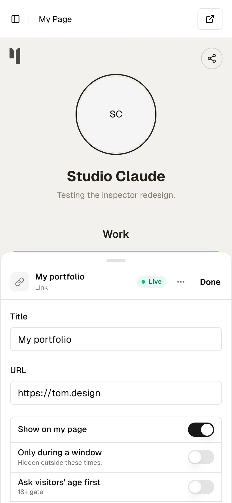
The sheet has two stages. It opens tall, ready for you to type, and the list behind it dims. Drag the handle down once for the half stage, where your list is in view and tappable. Touching any field pulls the sheet back up so the keyboard has room. Done closes it, and so does a quick flick down from the half stage.
Swipe a block right to pin it. A pinned block sits above the unpinned ones and carries a small pin beside its name, and it stays there: drag another block over it and that block settles back underneath. Swipe a pinned block right again to unpin it, and it keeps the place it was in rather than jumping away.
It pins to the top of where the block already lives, so a block inside a section goes to the top of that section rather than being pulled out of it, and a block on a tab stays on its tab. Pinned blocks can still be reordered among themselves.
Pin and Unpin are in the block's menu too, from a right-click or a long press.
Swipe a block left to delete it. Pull it past the line and let go: the row finishes the trip on its own, accelerating off the edge, and the block is deleted with an Undo in the message that follows. Let go short of the line and the row springs straight back, exactly as a pull to the right does.
There is a small buzz as the trash appears and a firmer one as you cross the line, so you can feel what letting go will do without watching. A quick flick commits either way, which is what makes both swipes work wherever on the card you start them.
The command palette
Press Cmd+K, or Ctrl+K, anywhere in the dashboard. Type to filter, arrows to move, Enter to run.
The palette adds any of the twenty-five block types by name, and it knows their synonyms: typing "newsletter" finds Email capture, "youtube" finds Embed. It also copies your page link and jumps between dashboard tabs.
Common questions
Is there a preview button? There is no separate preview. The stage is the real page, and the button with your handle on it at the top right opens the live page in a new tab. To see what a visitor meets, gates and all, open that in a private window.
Where did the tabs go? Nothing has tabs now. Tap the profile card for Details, the Design button for Design, and a block for that block. The thing you tap is the thing you get.
I added the wrong block. Do I have to delete it? No. Open it and tap its type under the name in the title bar, then pick the one you meant. The block changes in place and keeps its title, its address and its position.
Will changing a block's type lose what I typed? Anything the two types share carries across, and the old type's own settings are kept rather than deleted, so changing back returns what you had.
Why can I not duplicate this block? Drafts cannot be duplicated. Fill in whatever the chip says it needs, and Duplicate switches on.
Why can I not see my page while I am editing a block? The sheet covers your block list, not your page. The live page was there once and was either dimmed or cropped whenever the sheet was open, so it showed nothing worth the room. Use the button with your handle on it, at the top right, to open the real page in a new tab.
I moved a block and it went into a group. Blocks dropped between a group's children join the group. Open the block and set In group back to None, or use Move to group.
Does Cmd+Z undo colours as well? Yes. Appearance changes join the same history, so one undo walks back whatever you did last, whether that was a title or a background.